There has been a lot of speculation about why the polling from the Michigan Democratic Primary was inaccurate, but there hasn't been an adequate data driven explanation. The following is our attempt to explain the discrepancies between the polling in Michigan and the actual outcome.
Eight polls were included in our Michigan pollster rankings; of those, six were partially conducted within the week preceding the election. Of those six, five released sub-sample information. Michigan State University, our winner, released sub-sample results, but did not provide the total number of participants in each sub-group; for this reason the MSU poll was excluded from this analysis.
Of the four remaining polls, a cursory look at each sub-sample reveals universal inaccuracy; so where to begin? We're going to start with the turnout by age group revealed by exit polling; the forward assumption is that exit polling is accurate. The figure and table below depict the percentage of each age group that participated in the primary and the candidate margin within each group:
As you expected, Bernie did well among voters less than 40 years of age.
| MI Primary Results [2, 1] | Sanders (D) | Clinton (D) | Total |
|---|
| All | 49.75%
593,563 | 48.23%
575,512 | 1,193,169 |
| Age 18-24 | 85% | 15% | 11% |
| Age 25-29 | 75% | 24% | 8% |
| Age 30-39 | 59% | 36% | 17% |
| Age 40-49 | 41% | 55% | 17% |
| Age 50-64 | 41% | 57% | 27% |
| Age 65+ | 30% | 69% | 20% |
A repeated reason cited for the inaccuracy [3] of this cycle's polling in Michigan is the lack of historical data; Michigan was stripped of their delegates by the DNC for violating scheduling rules in 2008. Comparing the 2008 exit polling [4] to 2016 shows that Males represented 2% more of the electorate this year, Whites 2% less, Blacks 2% more, Ages 18-29 2% more and Ages 45+ 2% less. So while there may not have been an officially contested primary since 1992, the most recent primary in 2008 was generally predictive, and as we'll see below, was more predictive than the age distributions used in 2016 polling, but not the main problem.
In order to effectively analyze the age distributions of our four 2016 polls it is first necessary to normalize the groups into common ranges. This requires a little bit of math as each pollster uses different groups. We've explored a number of different algorithms for normalizing the groups such that they can be compared. For the purposes of this analysis, we're using a simple algorithm that subdivides each group into one year increments and assigns a uniform value to each of these subdivisions. Using the 18-24 group in the graph above as an example, the 1 year subdivisions would include {18,19,20,21,22,23,24} and each would have a value of (11%/(24-18+1)=) 1.57%.
The math used to re-adjust these one year increments into the desired ranges was a simple local regression with the same values we use for our polling projections; a 2nd degree polynomial with an 80% nearest neighbor parameter. The intent of using the local regression was to smooth out any spikes which may have occurred on range boundaries; in practice the local regression had very little affect because the polled ranges were largely smooth already.
There is one undefined parameter which affects how our extrapolation behaves. The upper bound on the oldest age group is not defined, it's generally an unbounded value like 65 and older. This complicates our uniform calculation which requires knowing the span of a given group. We experimented with several methods to compensate for this unknown; we settled on hard-coding the upper limit at 80 for three reasons. First, the upper bound made very little difference on any of the groups other than the two oldest groups, and the affect was at worse a deviation of 2% within the two oldest groups. Secondly, the overall sum of all subdivisions was nearest to 100%. Finally, the basic demographic acknowledgement that just 3.5% of the whole US population is 80 or older [5]. We're exploring more robust means to extrapolate the upper age group using population modeling, but we're not there yet; for now there is a procedural human element.
The figure below depicts the outcome of the range re-adjustment from the samples across each of our four polls. On the right, we then compare the sampled frequency in each age group using values from the left, to those observed in the exit poll from the first figure above:
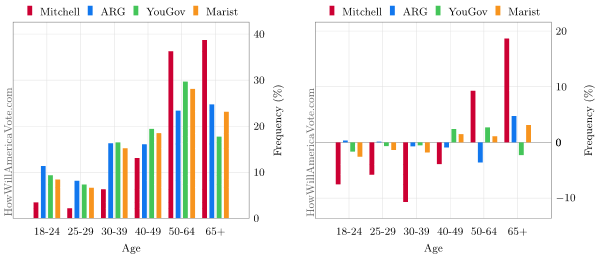
Figure 2: Turnout By Age: Pre-Election Sample by Age & Pre-Election vs. Exit Polling
The general takeaway of the above figure is that pollsters underestimated younger voters and overestimated older turnout. Voters under the age of 40 were under represented by about 8% on average and those over 40 were over represented by about 8%. The data is sparse, for example, American Research Group only released two age groups, so an average is not the most rigorous measurement but there also isn't enough data to do anything more complicated. If we remove Mitchell Research which visually appears to be the outlier, the error drops from 8% to 3% which is worse than 2008's exit polling. The weighting was less accurate than it could have been, but it wasn't the biggest problem with Michigan polling.
Our final figure extrapolates a candidate's support, by margin, into the common age groups and then compares those figures with the margins observed in exit polling:
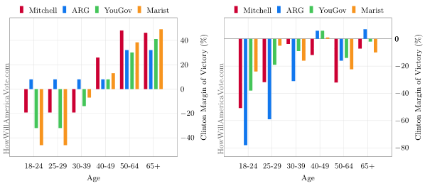
Figure 3: Candidate Support By Age: Pre-Election Support by Age & Pre-Election vs. Exit Polling | Edit: Original
Young voters were underrepresented and their loyalty skewed. A correlation between increased youth participation and polling inaccuracy may exist, but further analysis is required.
Update [April 12]: We were were performing a similar age grouping analysis in New York and realized that the final graphic incorrectly depicts one of the alternative algorithms not described within the preceding text. The image has been corrected and the original preserved for reference in the figure caption. As one further note of clarification, the margin extrapolation makes no attempt to intelligently guess at groups in which there is no data, a uniform assumption is made; this is apparent in the ARG bars given they only released data in two age groups.
Updated on April 12, 2016 at 10:37:03 PM CT